
Explaining machine learning models
Packages
library(tidyverse)
library(caret)
library(magrittr)
library(DALEX)
Overview
This blog will cover DALEX explainers. These are very useful when we need to validate a model or explain why a model made the prediction it made on an observation basis.

The data
To show our explainers in action we will use the apartments dataset that ships along with the dalex package:
test_data <- DALEX::apartments

test_data %>% head
## m2.price construction.year surface floor no.rooms district
## 1 5897 1953 25 3 1 Srodmiescie
## 2 1818 1992 143 9 5 Bielany
## 3 3643 1937 56 1 2 Praga
## 4 3517 1995 93 7 3 Ochota
## 5 3013 1992 144 6 5 Mokotow
## 6 5795 1926 61 6 2 Srodmiescietest_data %>% dim## [1] 1000 6The problem
Say we want to predict the m2.price of the appartment, but this prediction needs to be validated for different sized properties. In this case it’s not good enough to measure only a global fit. If for example the model fails to predict properly the value of expensive properties due to sample size and variability it could mean a large amount of risk if the model was deployed in production.
Benchmark many models with caret
To start off we want to throw a bunch of models at the problem to see what we are dealing with in terms of predictive power. Since DALEX is model agnostic we can simply leverage our caret package:
Set crossvalidation parameters
trControl <- trainControl(method = "cv",number = 4)Build model data framework
train_data <-
    tibble(model = c("rf","gbm","lm","glm","ridge"),data = list(apartments))
Train models
model_frame <- train_data %>%
    mutate(caret_models = map2(.x = model,.y=data,~train(form = m2.price~., data = .y,method = .x,trControl = trControl)))
Let’s pull out the root mean squared error from the models:
 model_frame %<>%
    mutate(RMSE = caret_models %>% map_dbl(~.x %>% pluck("results","RMSE") %>% min))

model_frame
## # A tibble: 5 x 4
## model data caret_models RMSE
## <chr> <list> <list> <dbl>
## 1 rf <data.frame [1,000 x 6]> <S3: train> 174.
## 2 gbm <data.frame [1,000 x 6]> <S3: train> 85.8
## 3 lm <data.frame [1,000 x 6]> <S3: train> 283.
## 4 glm <data.frame [1,000 x 6]> <S3: train> 284.
## 5 ridge <data.frame [1,000 x 6]> <S3: train> 284.model_frame %>%
ggplot()+
geom_bar(aes(x = model,y=RMSE,fill=model),stat="identity")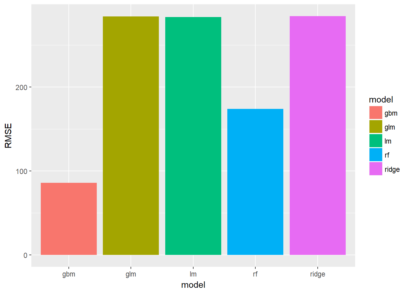
We can see that the random forest and gradient boosted models perform much better out of the box as expected.
Visualize the residuals
Before we throw our new explainers at the models let’s quickly look at these residuals.
We can plot the distribution of residuals to get a better idea of what’s going on, but first we need to pull these out of the models:
model_frame %<>%
    mutate(residuals = map2(data,caret_models,~predict(object = .y,.x)-.x %>% pull("m2.price")))
Visualize the distribution:
model_frame %>%
    unnest(residuals) %>%
    ggplot()+
    geom_histogram(aes(x=residuals,fill=model))+
    facet_wrap(~model)+
    ggtitle("Distribution of errors by model")
## `stat_bin()` using `bins = 30`. Pick better value with `binwidth`.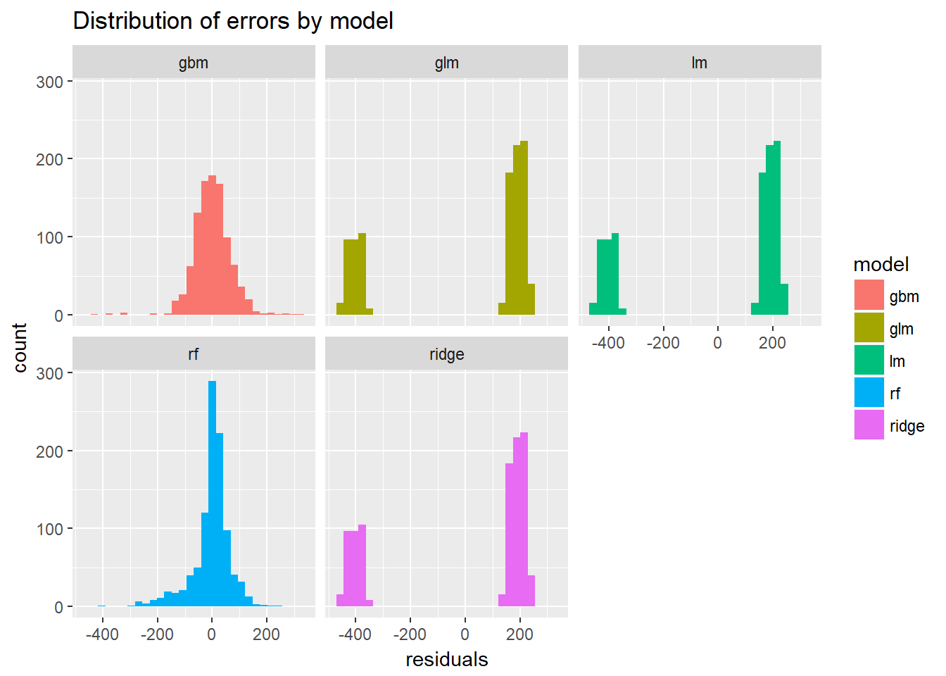
Let’s visualize the predicted vs. actuals:
model_frame %<>%
    mutate(predicted = map2(data,caret_models,~predict(object = .y,.x))) %>%
    mutate(actuals = data %>% map(~.x %>% pull("m2.price")))
model_frame %>%
unnest(predicted,actuals) %>%
ggplot(aes(x=actuals %>% log,y=predicted %>% log,col=model))+
geom_point()+
geom_abline(slope = 1,intercept = 0)+
facet_wrap(~model)+
ggtitle("Actuals vs predicted on log scale")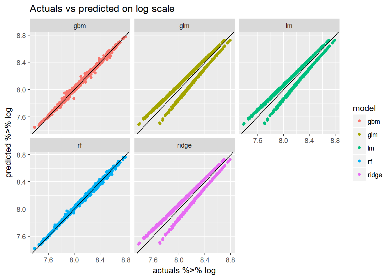
We notice that the linear models tend to underestimate the value of the appartment more often than over estimating it.
Introducing DALEX explainers!
There’s a lot we can do with packages like yardstick and broom to pull out performance metrics and make plots. But this may still feel very very clumsy and amateurish. How can we quickly and easily produce more professional looking reports to show prospective clients and stakeholders?
The answer might be either DALEX or LIME. A new package that works with DALEX explainers is modelDown. This package allows us to create a static webpage to show off the performance of our models and also crutinize them.
So how does it work?
The DALEX::explainer needs the following:
- a model object
- data
- actuals (to be predicted)
- function that can get the predicted values
I quickly map over all my models to create an explainer for each of our models:
model_frame %<>%
    mutate(explainers = pmap(list(model,data,caret_models,actuals),~explain(model = ..3,data = ..2,y = ..4,label = ..1,predict_function = predict)))
Since we really only care about the good models I can filter the rest out:
good_models <-
    model_frame %>%
    filter(model %in% c("rf","gbm"))
The modelDown::modelDown() function wants you to supply each explainer as an input in the dots(…) argument. To do this easily I just use the purrr:invoke function to pull them out of our table:
invoke(modelDown::modelDown,good_models$explainers)This will produce the website with some explainers from the DALEX package.
Model performance
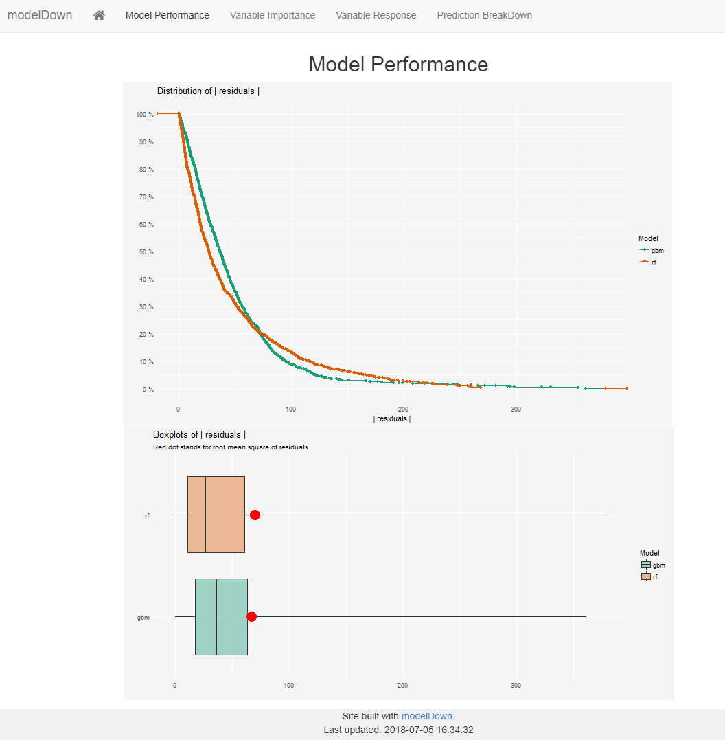
The first tab produces our risidual distribution plots for all provided models. My only criticism here is that they only show positive errors. This might hide some information about bias.
Variable Importance
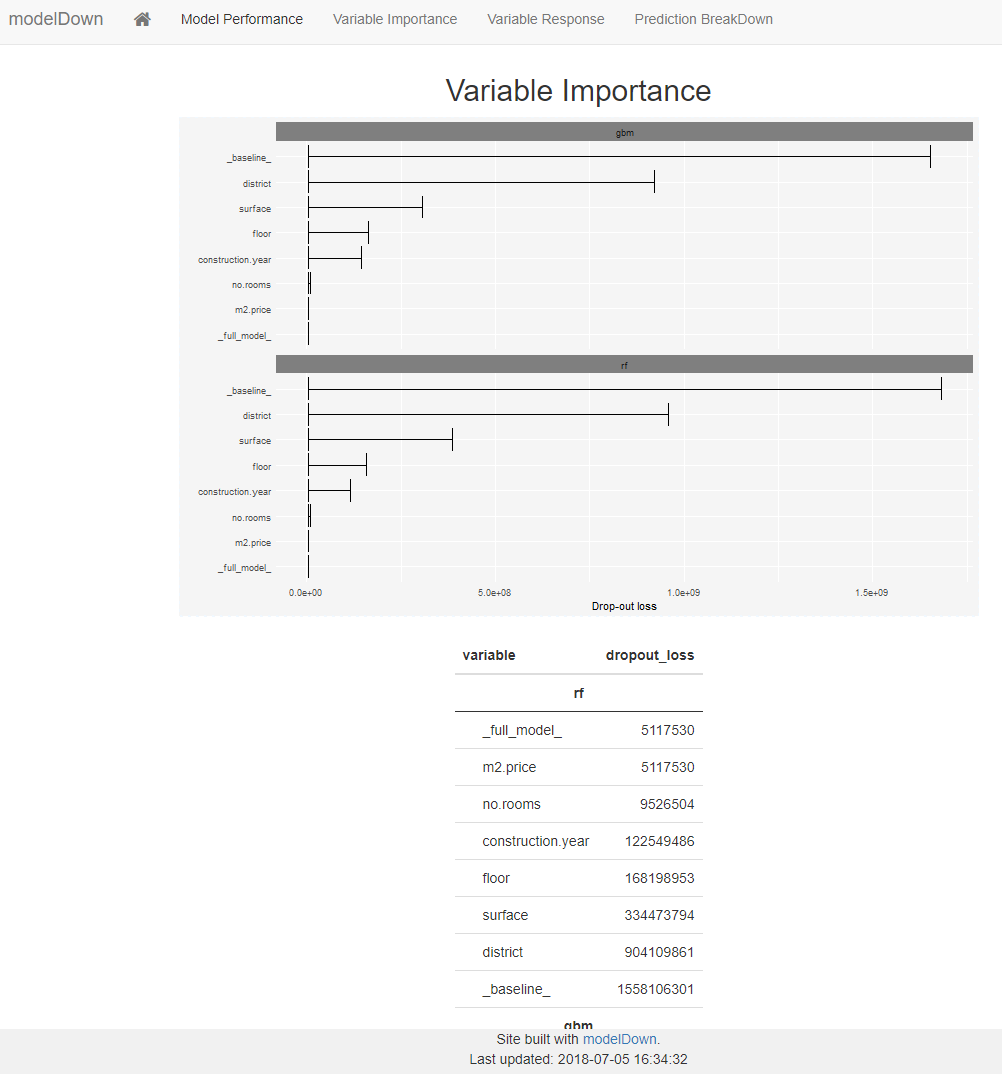
The next tab shows us how important certain variables in the data were to the model. This is very standard output that we would normally produce anyway. But it’s nice to have it in here so we don’t have to worry about doing that ourselves.
Variable response
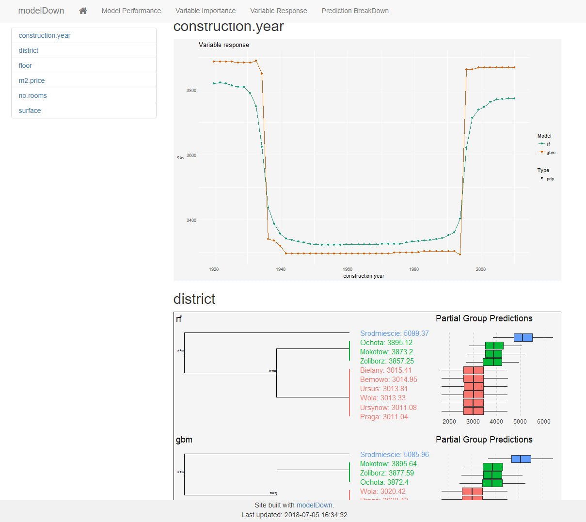
This is where things get juicy!
For each variable in the data the model will show us how the prediction function responds to changes in said variable.
This is fantastic since we can validate the assumptions made by the model. For example; is it reasonable that very old and very new houses should respond in this way?
For factor level variables the explainer does something even more awesome! The explainer will try to figure out how each level affects the response of the model (for each model). In the screenshot we can see 3 distinct district groups that affect the price of the property. This gives us immediate insight in the data without having to explore these sub levels ourselves!
Prediction breakdown
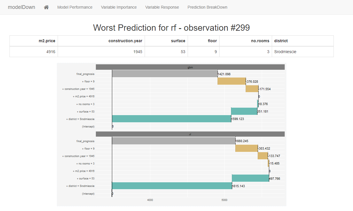
This page uses the function DALEX::prediction_breakdown() on the observation with the largest residual. This is really cool because we can see which variable would have pushed the price up and which would have done the opposite. In this example we see that the specific district completely over emphasized the price of this appartment because the district generally has very expensive appartments.
This DALEX funcion is very useful if we find observations that we need to explain. For example if we have trained and vetted a model that is currently running in production, we may deliver prediction to users via an app. These users may benefit from a breakdown to better sense check the predictions coming through.