
Body Temperature Series of Two Beavers
This short post will explore a funny dataset that comes are part of R’s dataset library. The dataset will called out of interest of what it contains as well as using it to enagage with Hadley Wickhams’s ggplot2 package.
Reynolds (1994) describes a small part of a study of the long-term temperature dynamics of beaver Castor canadensis in north-central Wisconsin. Body temperature was measured by telemetry every 10 minutes for four females, but data from a one period of less than a day for each of two animals is used here.
library(ggplot2,quietly = T)
library(datasets,quietly = T)
First we load the data from the datasets library. This package encompasses some interesting works and is definately worth a look if you need generic data to experiment with.
data(beavers)
head(beaver2)
## day time temp activ
## 1 307 930 36.58 0
## 2 307 940 36.73 0
## 3 307 950 36.93 0
## 4 307 1000 37.15 0
## 5 307 1010 37.23 0
## 6 307 1020 37.24 0Next the idea is to use ggplot to see if the temperature of the beaver differs greatly between active and non-active times. A nice feature of ggplot is the easy incorporation of color differentials between factors. Here I am leaving it as continous though
qplot(beaver2$time,beaver2$temp,
      colour=beaver2$activ,
      geom="point",
      shape=I(16))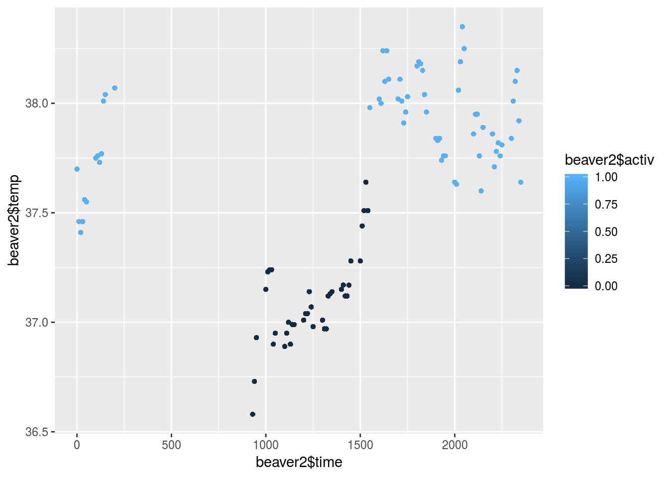
Try and create a template to work off of in the future. So think of creating containers for different shapes, colors, labels, headings and of course statistical visualization of the relationship of the data with the geom_smooth parameters.
One of the features that is easily implemented but can have high impact is the facets parameter. This easily splits your visualization window into multiple plots to get a clearer idea of the dynamics of specific factors.
beaver2$activ<-ifelse(beaver2$activ==1,"Active","Dormant")
qplot(time,temp,
      colour=activ,
      facets=activ~.,
      geom=c("point","smooth"),data=beaver2)+
      theme_bw(base_size = 12, base_family = "")
## `geom_smooth()` using method = 'loess' and formula 'y ~ x'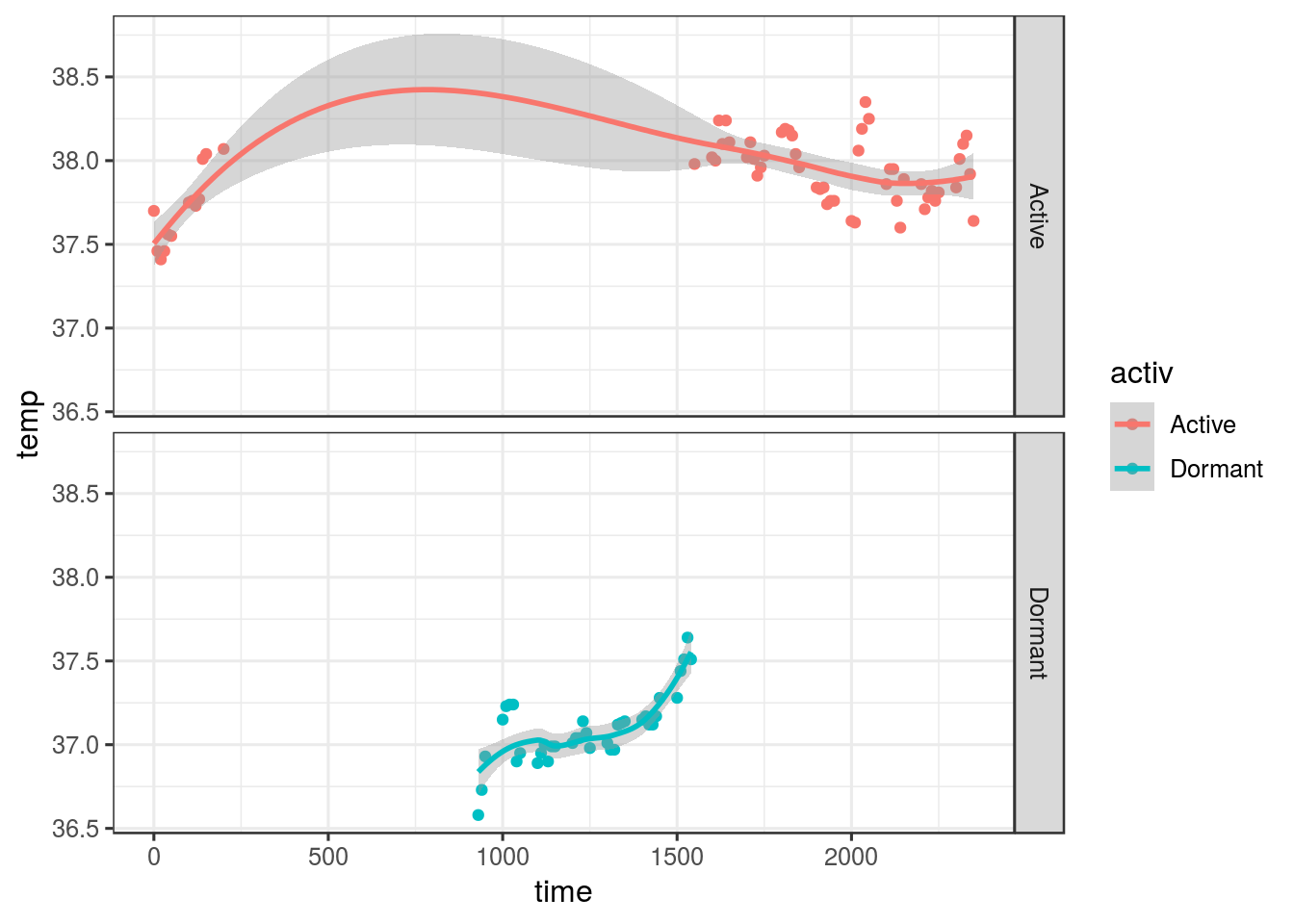
ggplot(beaver2, aes(activ, fill=activ)) +
  geom_bar(width=1) +
  coord_polar() +
  theme_bw(base_size = 12, base_family = "")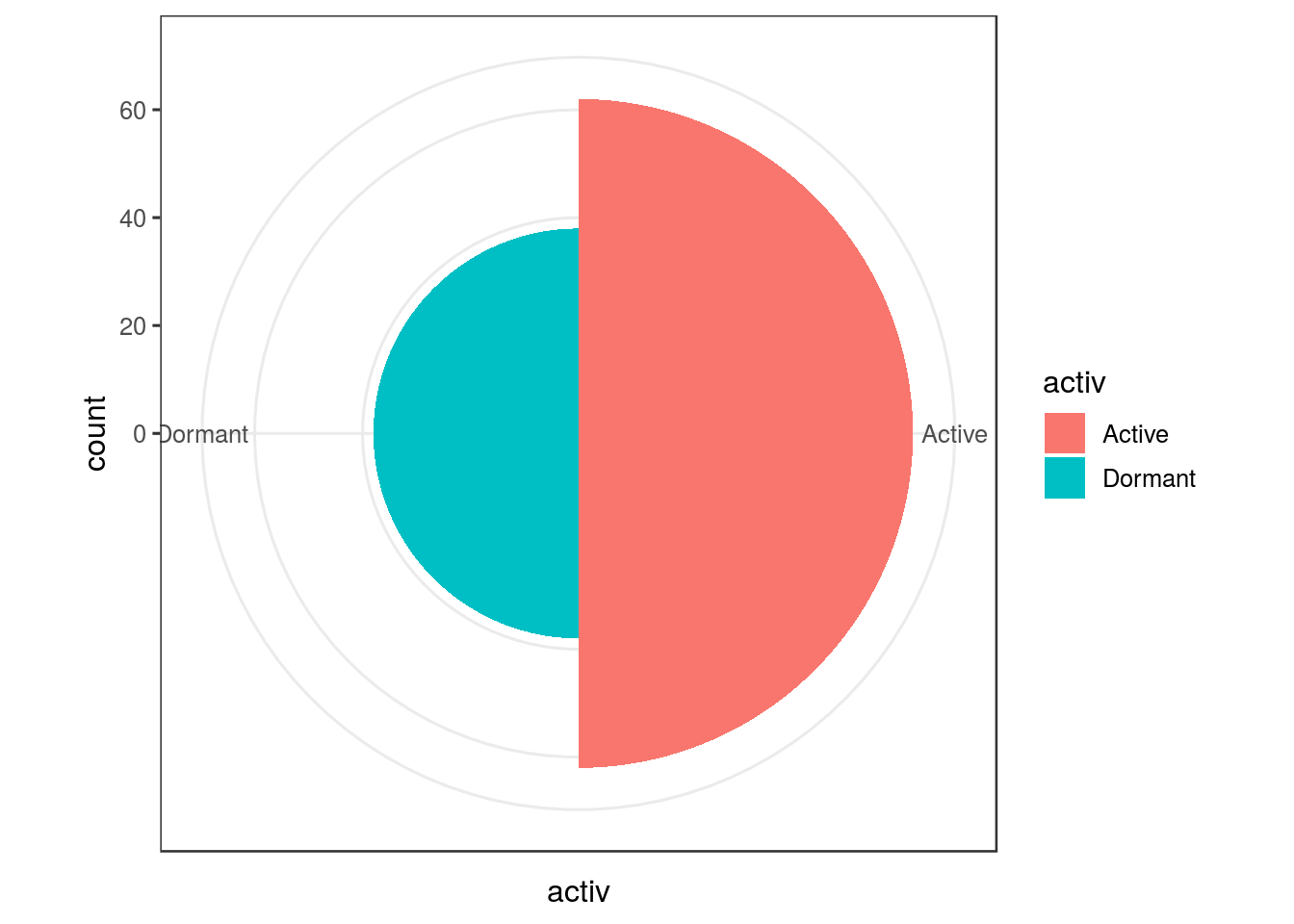
One of the things that do irritate me about using ggplot is the grey backrgound that is set as the default. A much clearer and widely used format is the theme of a white background with black gridlines
qplot(data=beaver2,x=activ,y=temp,geom="boxplot", colour=activ)+
  theme_bw(base_size = 12, base_family = "")+
   labs(title = "Boxplot of Temperatures",x = "Beaver State",y="Temperature",colour="State")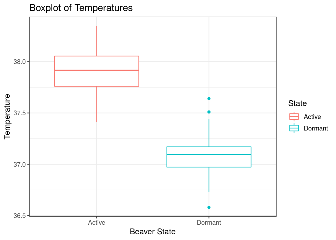
This concludes our short discussion on the use of the ggplot2 package. I do find having learned to plot with base feature in R, the notational difference is difficult to integrate when I am coding and it doesn’t come naturally yet. The package is however flawlessy built with great flexibility in its features and I enjoy how it integrates with the Caret machine learning package.
Despite not using the package on a day to day basis, after using it again to write this post, I do find myself thinking, why am I not…